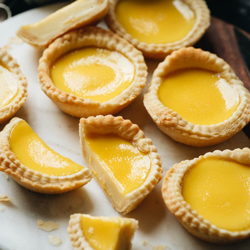
Hong Kong Style Egg Tarts
Ingredients
- 2 cups all purpose flour (fluffed and spooned into measuring cup)
- 1/8 teaspoon salt
- 12 tablespoons unsalted butter (slightly softened)
- 2 tablespoons cold water
- ½ cup granulated sugar
- 1 cup hot water
- 1/2 cup evaporated milk (at room temperature)
- 3 large eggs (at room temperature)
- 1 teaspoon vanilla extract
Instructions
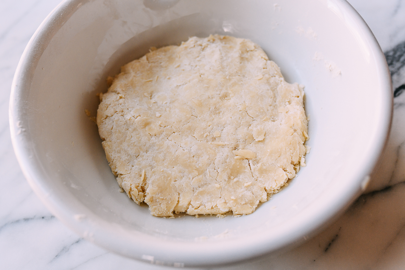
- In a bowl, combine the flour and salt. Cut in butter until mixture resembles coarse crumbs.
- Add cold water and bring the dough together. Wrap and refrigerate for 20 minutes.
- Roll dough to a rectangle, fold, turn, and repeat. Chill for 1 hour.
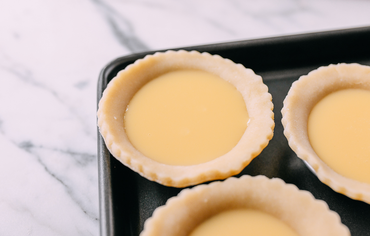
- Meanwhile, dissolve sugar in hot water, cool, then whisk in milk, eggs, and vanilla. Strain.
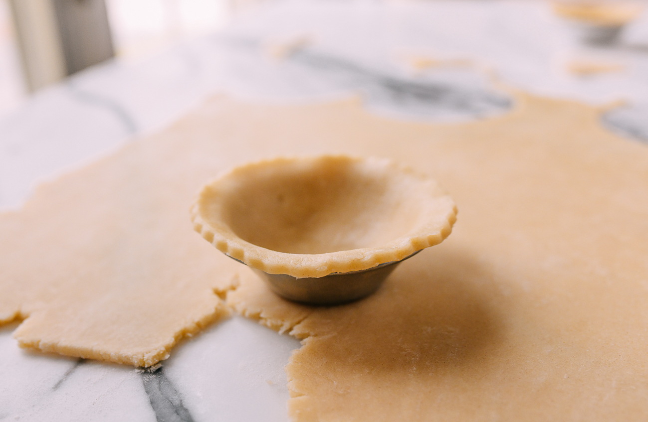
- Preheat oven to 375°F/190°C. Roll dough 5mm thick, cut circles, and line tart tins.
- Fill shells three quarters full with custard. Reduce oven to 350°F/180°C, bake 26–29 min.
- Cool at least 10 minutes before serving.
Source:
The Woks of Life
Sample Images
Recipe Websites
-
Budget Bytes:
The site is focused and clear on its audience and purpose. The name and design of showing the price per recipe and serving show that this website is for finding recipes that are affordable and accessible. The navigation is descriptive with categories such as "Recipes under $10" and "Vegetarian Recipes."
-
Bon Appétit:
Recipes have different tags such as "Easy" and "Quick," which help set expectations and ensure users find a recipe fit for them. Beyond just recipes, there is also a section about different cooking techniques and tools, which I thought was unique.
-
Serious Eats:
The website uses headings, subheadings, and creative layout design to ensure clarity and readability. I enjoy how images are widely used across the site, and it gave me inspiration on how to use images to catch the attention of users.
Non-Recipe Websites
-
Eye on Design:
This website instantly catches your attention upon page load with a striking animated graphic. When you click on the drop-down menu, the different categories are clearly defined visually and verbally.
-
Walker Art Center:
I like the three-column layout of this website. The typography is simple and uses subtle hover changes to convey direction to users.
-
Uneven Objects:
This is a minimalistic website that relies on visual design and typography for effective communication. I especially like the way this site uses different fonts to emphasize "uneven" and the phrase "Shape. Shift. Stand Out.”